brisket baddies

BRISKET BADDIES SET OUT TO CHALLENGE EXPECTATIONS OF PLANT-BASED FOOD BY COMBINING SOUTHERN BARBECUE, WESTERN CULTURE, AND FEMININE ENERGY INTO A BRAND DESIGNED TO FEEL PLAYFUL, CULTURALLY RELEVANT, AND IMMEDIATELY RECOGNIZABLE.

objective:

BUILD A VISUAL IDENTITY THAT COULD EXTEND BEYOND FOOD INTO MERCHANDISE, EVENTS, AND COMMUNITY.

scope

  • brand strategy

  • brand identity

  • ART DIRECTION

  • CAMPAIGN CREATIVe

  • product development

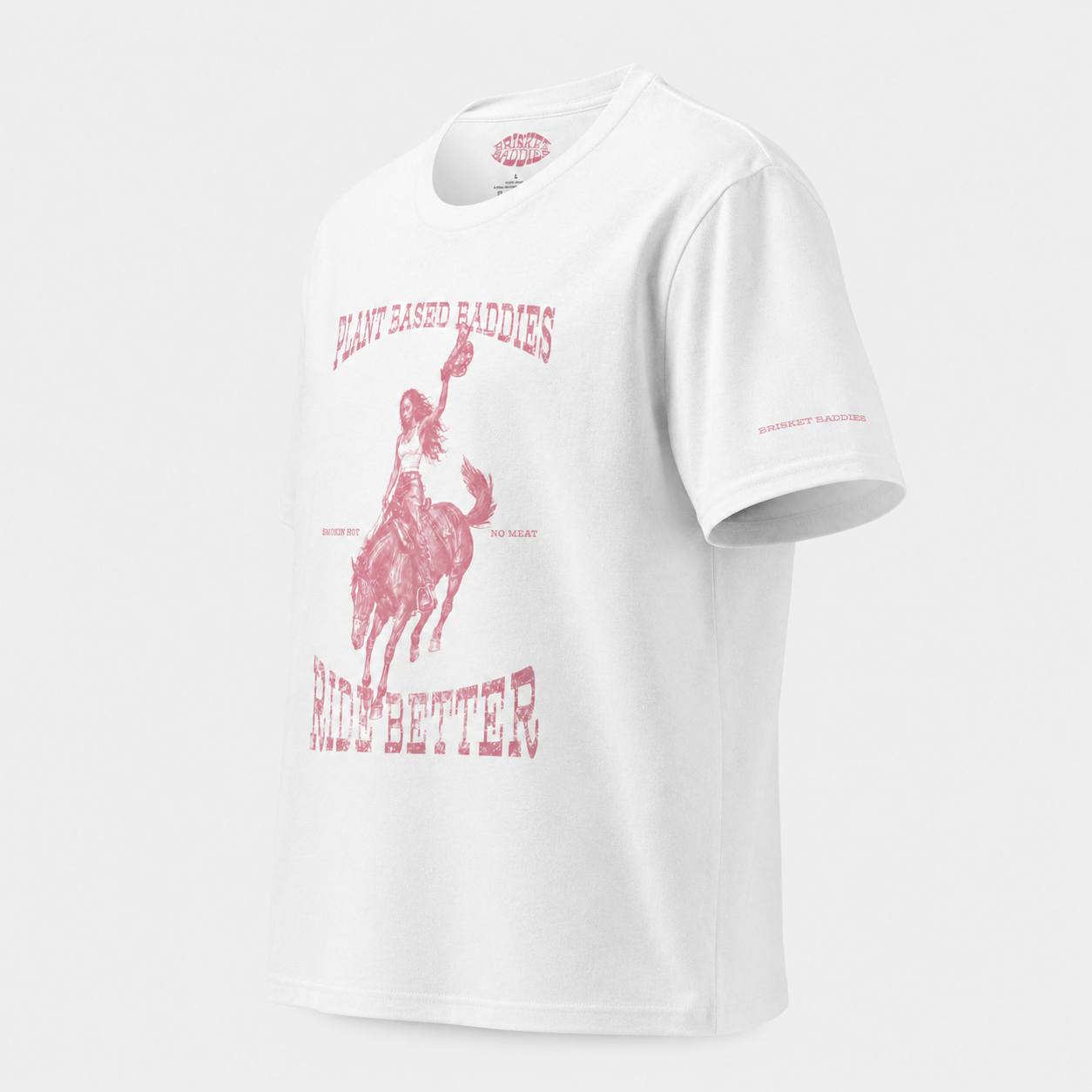
  • merchandise design

  • shopify development

Foundation

1

Plant based food is often marketed through restriction.


Brisket Baddies took the opposite approach.Instead of selling sacrifice, the brand sells indulgence, personality, and Southern hospitality.


structure

2

The identity was built to move beyond food.

It needed to work across pop-ups, merchandise, campaign imagery, social content, event materials, and e-commerce without losing recognition.

The structure gave the brand enough consistency to feel familiar and enough flexibility to keep expanding.


expression

3

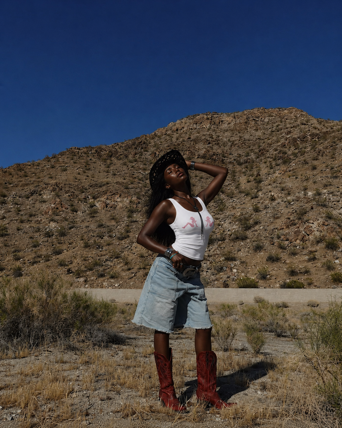
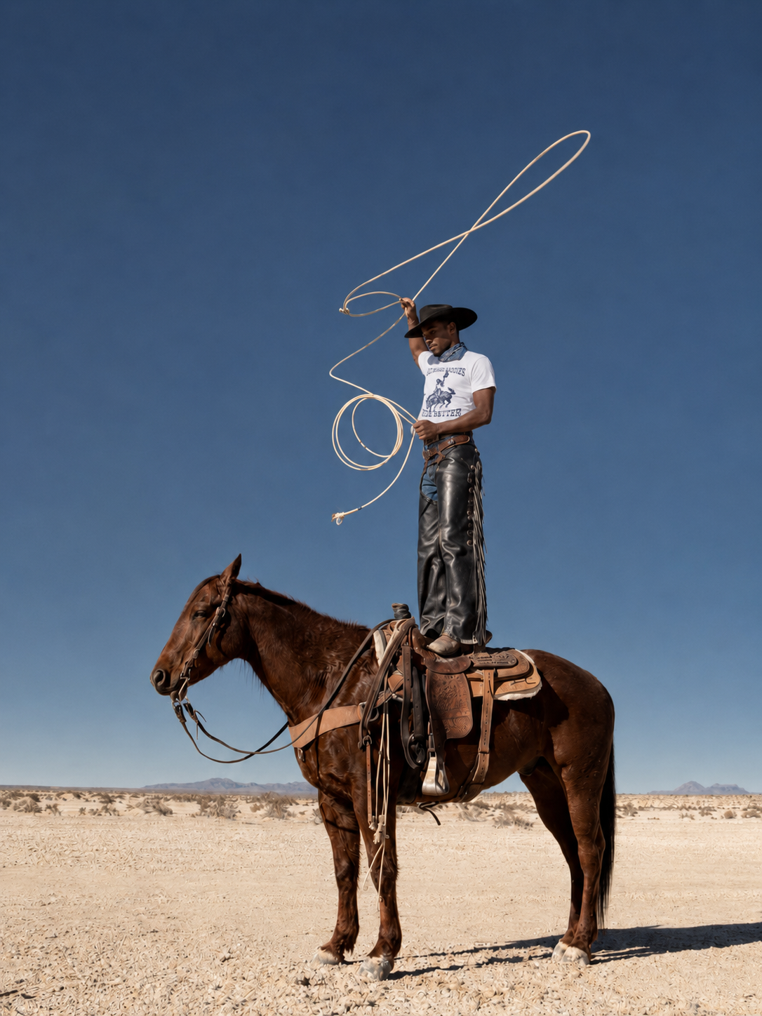
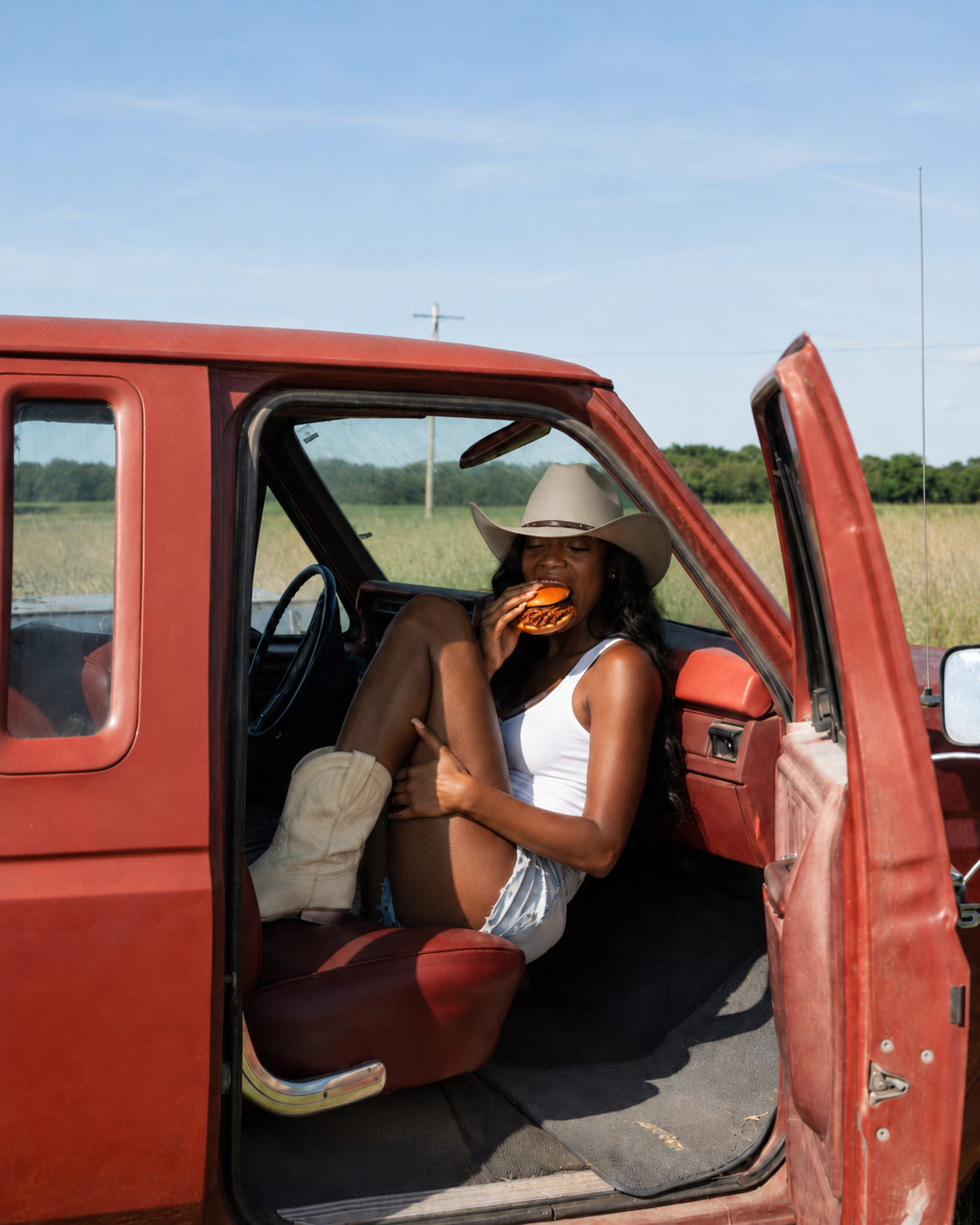
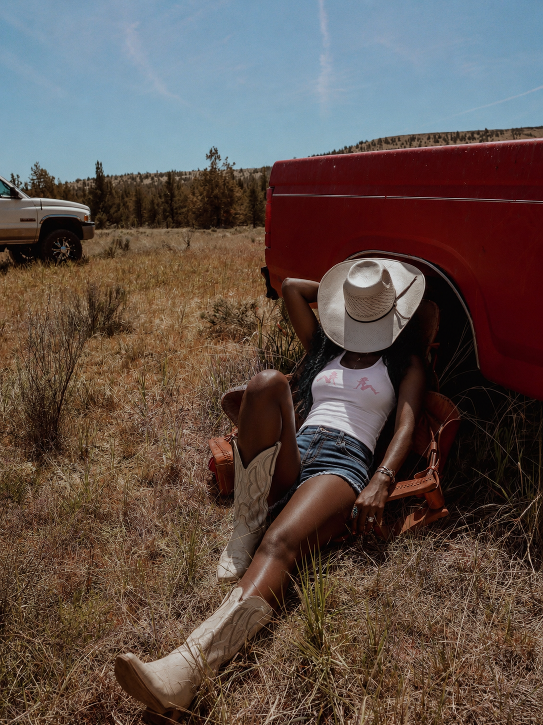
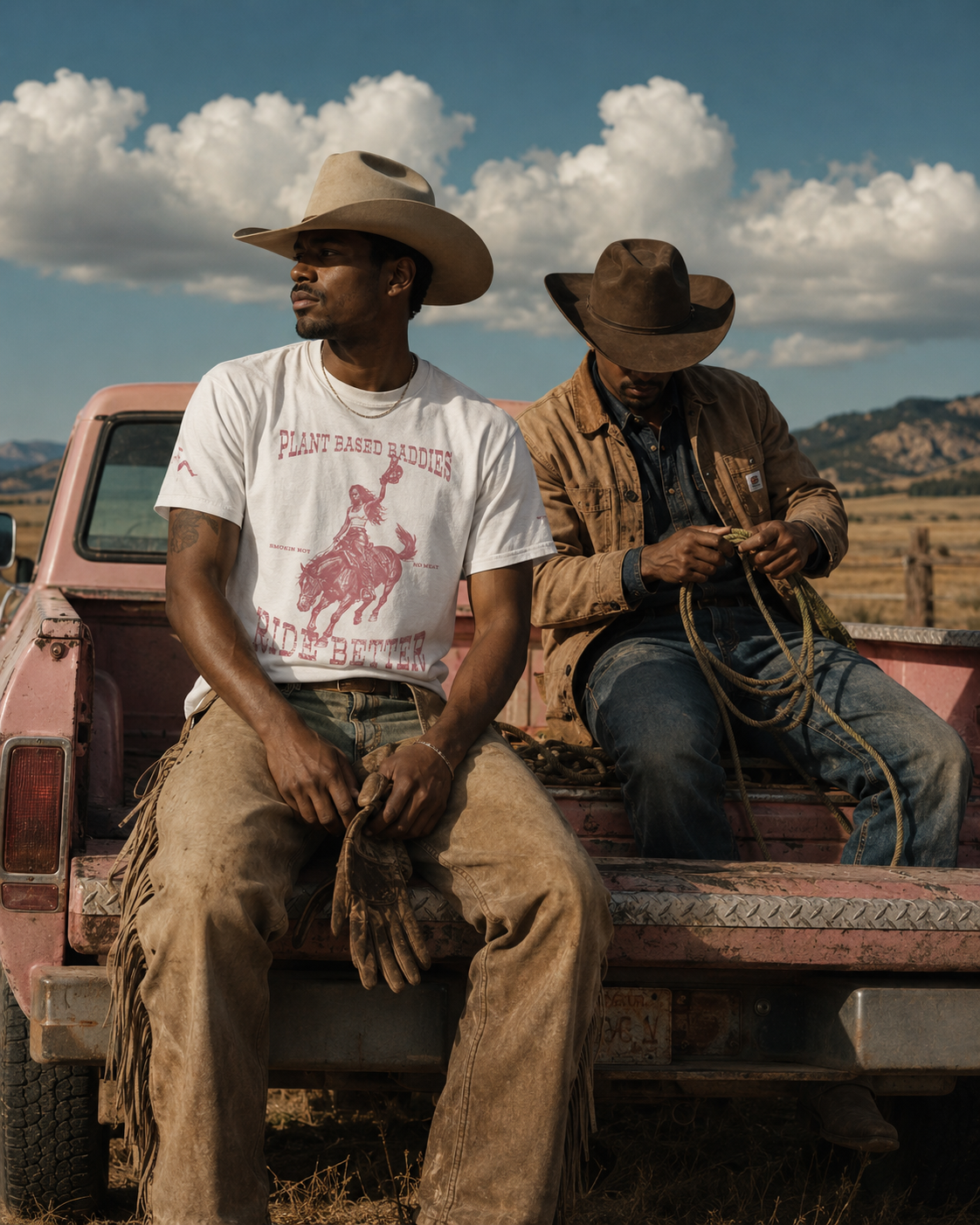
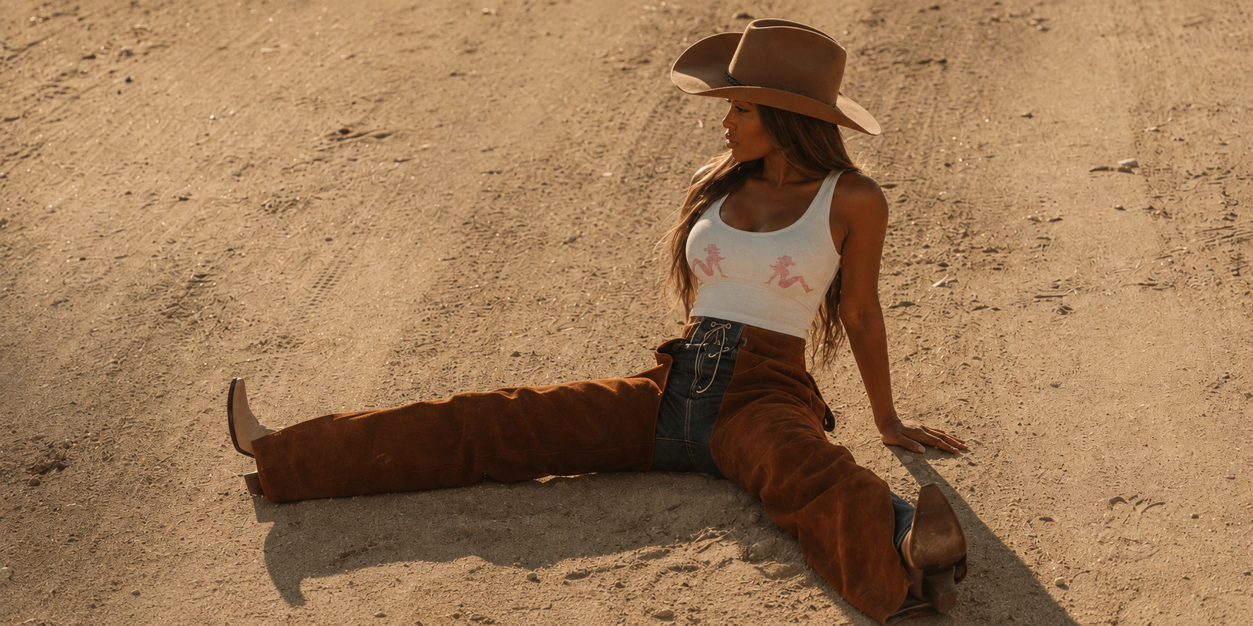
The world came to life through bold typography, western references, warm photography, playful language, and lifestyle-driven visuals.

Every touchpoint was designed to feel recognizable, from the merch to the menu to the way the brand showed up online.


outcome

4

Brisket Baddies evolved from a food concept into a lifestyle-driven brand with a clear point of view.

The final identity gave the brand room to grow across food, merchandise, events, digital content, and future retail experiences while still feeling unmistakably Brisket Baddies.

shopify design

typography analysis

“bio rhyme”

BioRhyme was selected for its bold shape, strong presence, and expressive character. Its chunky letterforms match the confidence, humor, and western influence of Brisket Baddies, while still keeping the identity clean and readable. The typeface helps the brand feel playful, recognizable, and full of attitude across merch, social content, and event materials.

Next
Next

The Hood Healer