the hood healer
Spiritual guidance rooted in truth, intuition, and self-awareness.
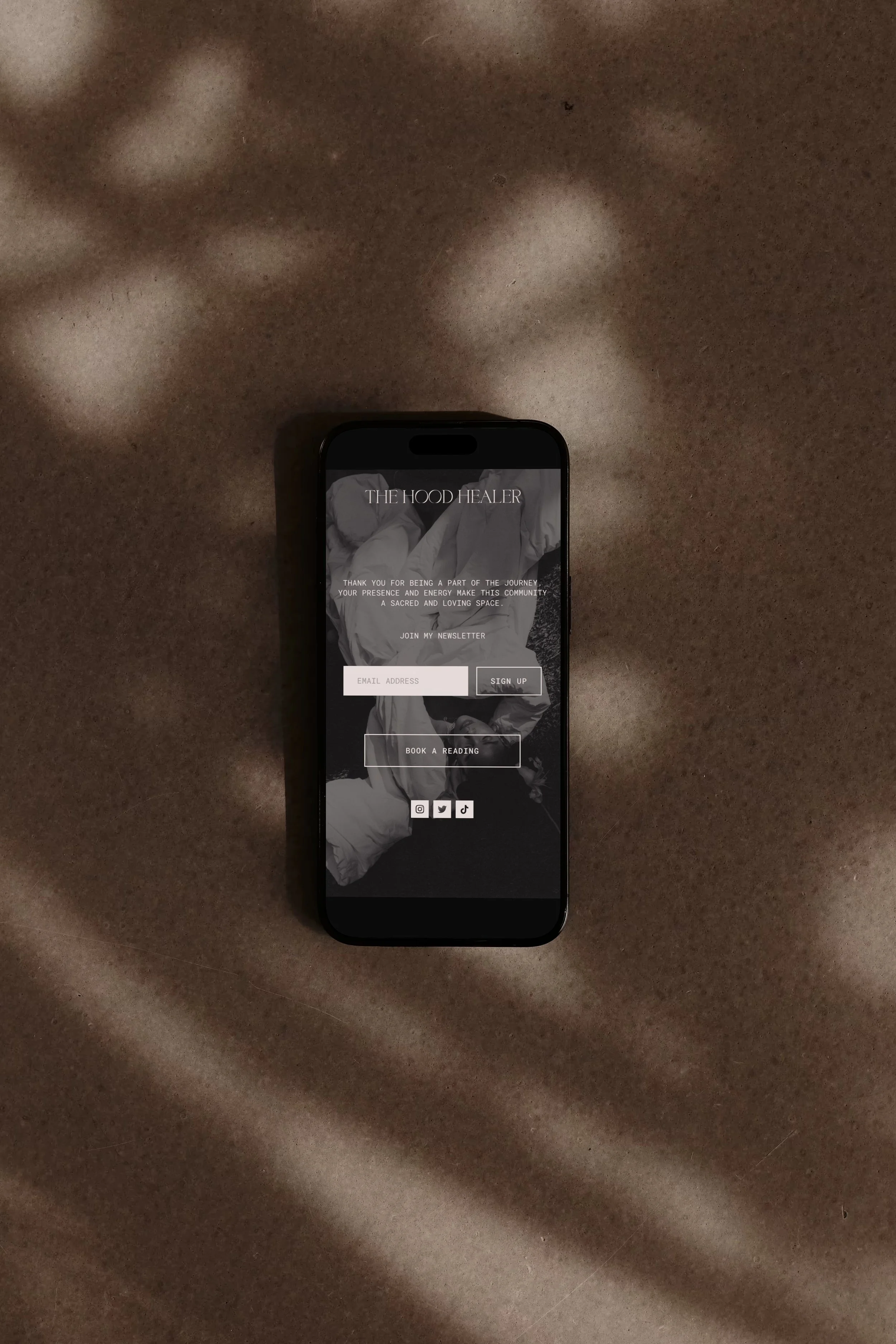
The Hood Healer is a spiritual platform built around intuitive guidance, personal transformation, and helping people understand themselves more deeply.
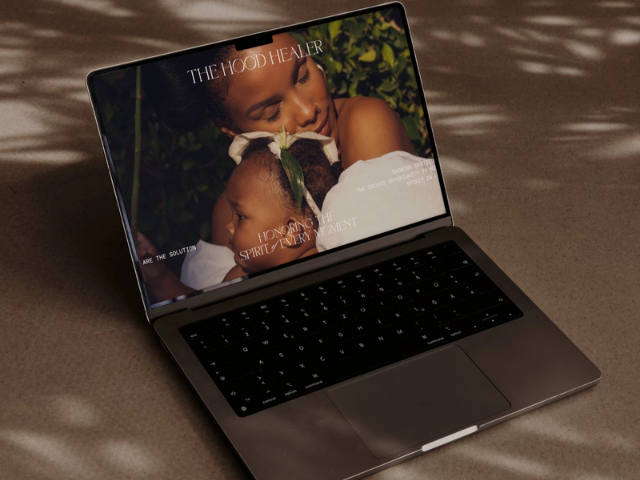
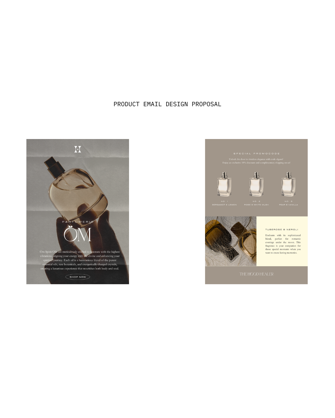
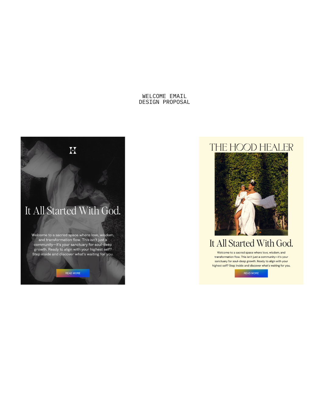
The work focused on giving the brand a stronger visual and digital presence while supporting its expansion across merchandise and online experiences. The goal was to create an identity that could hold the personality and perspective behind the platform without overcomplicating what made it compelling in the first place.
THE SCOPE
Brand Strategy
Brand Identity
Creative Direction
Art Direction
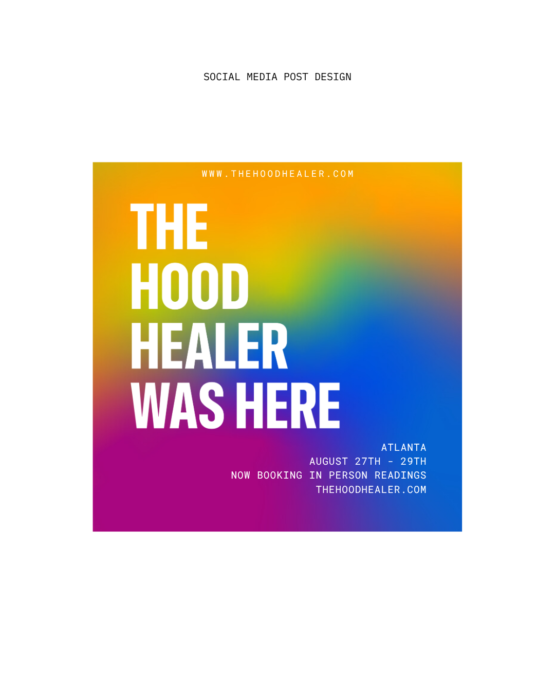
Campaigns
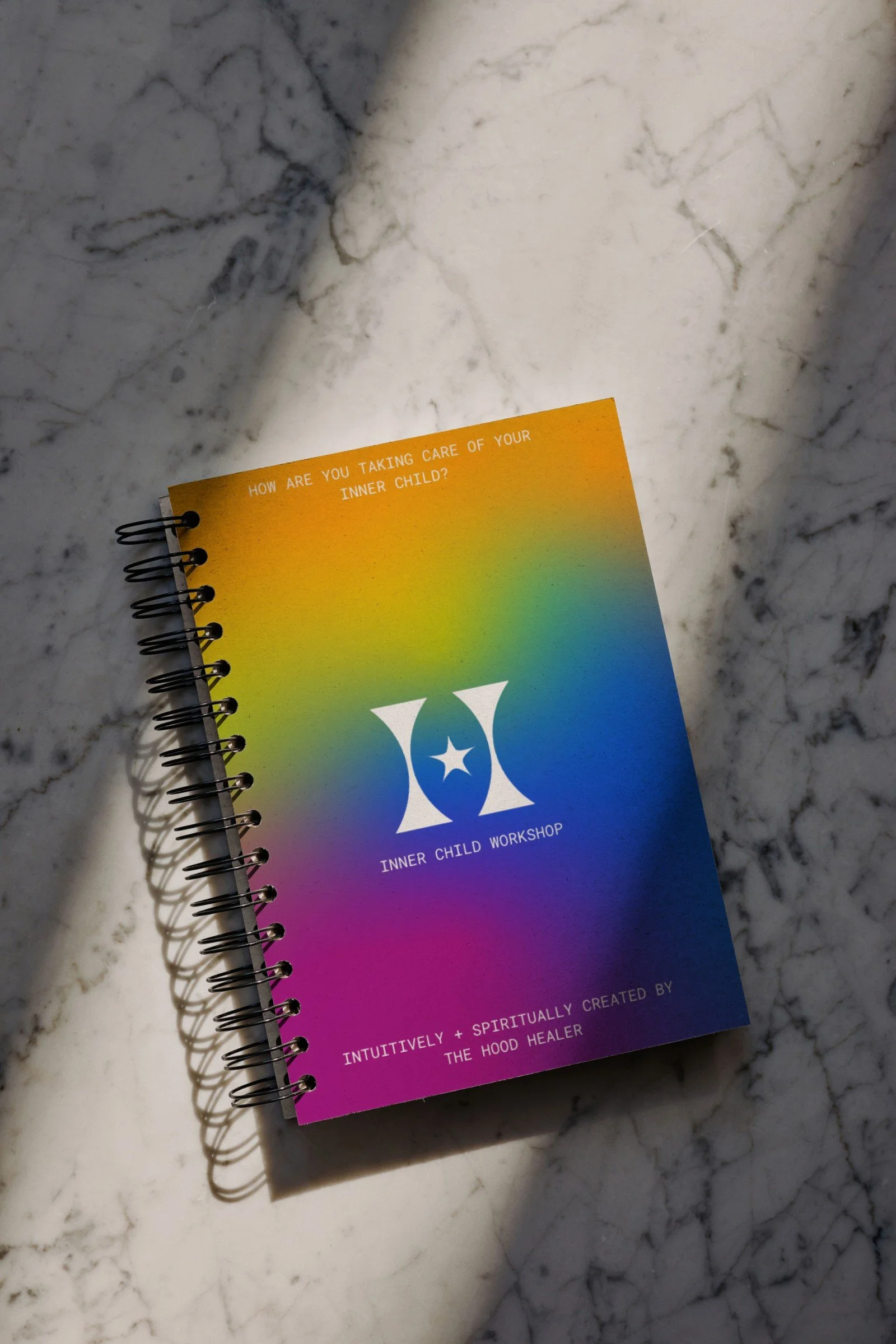
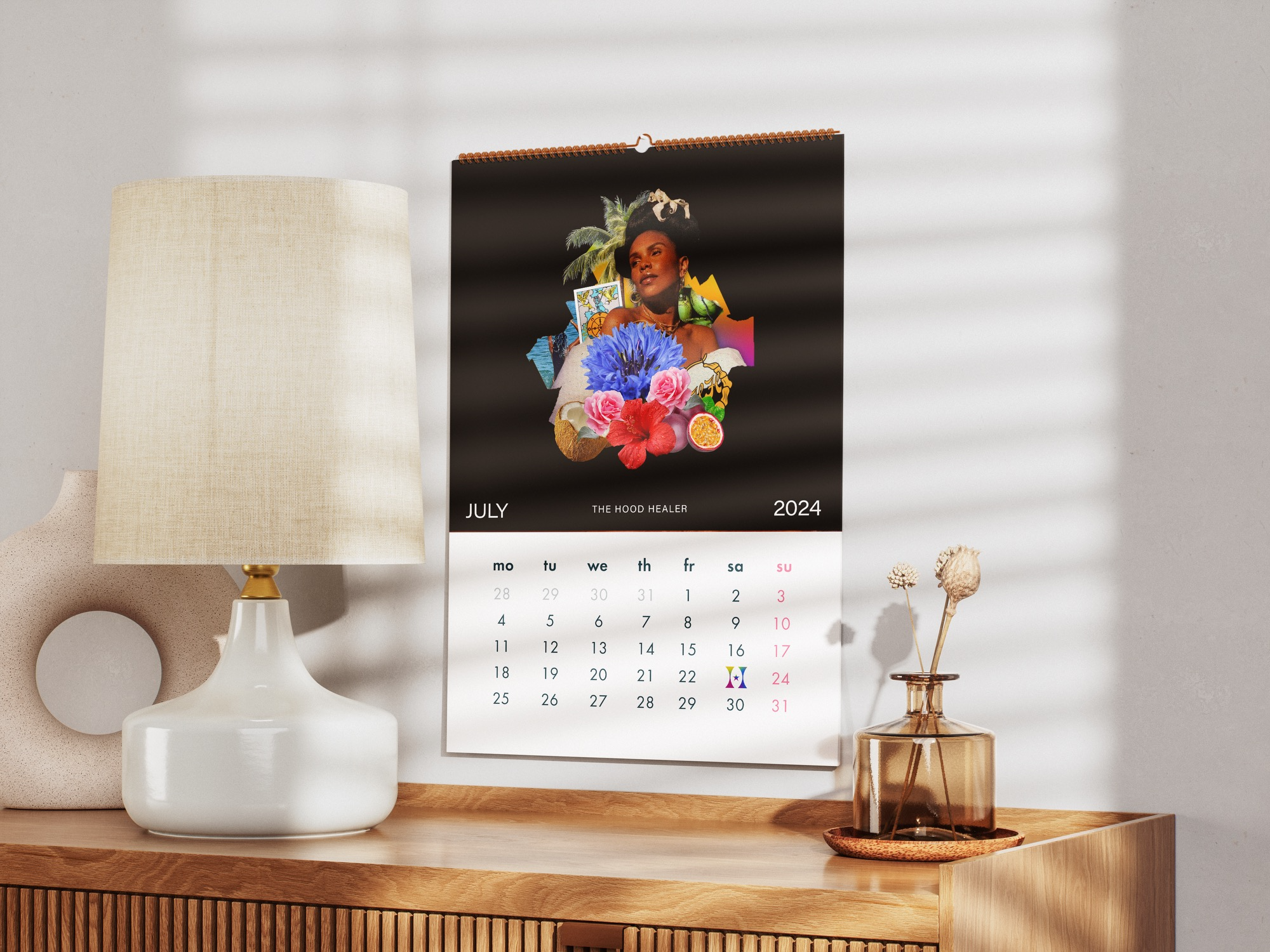
Merchandise
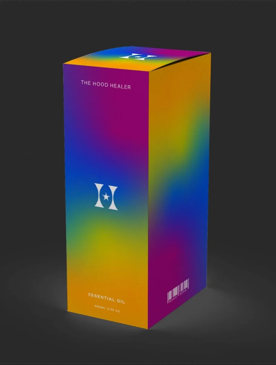
Packaging
Digital Experience
COLOR SYSTEM
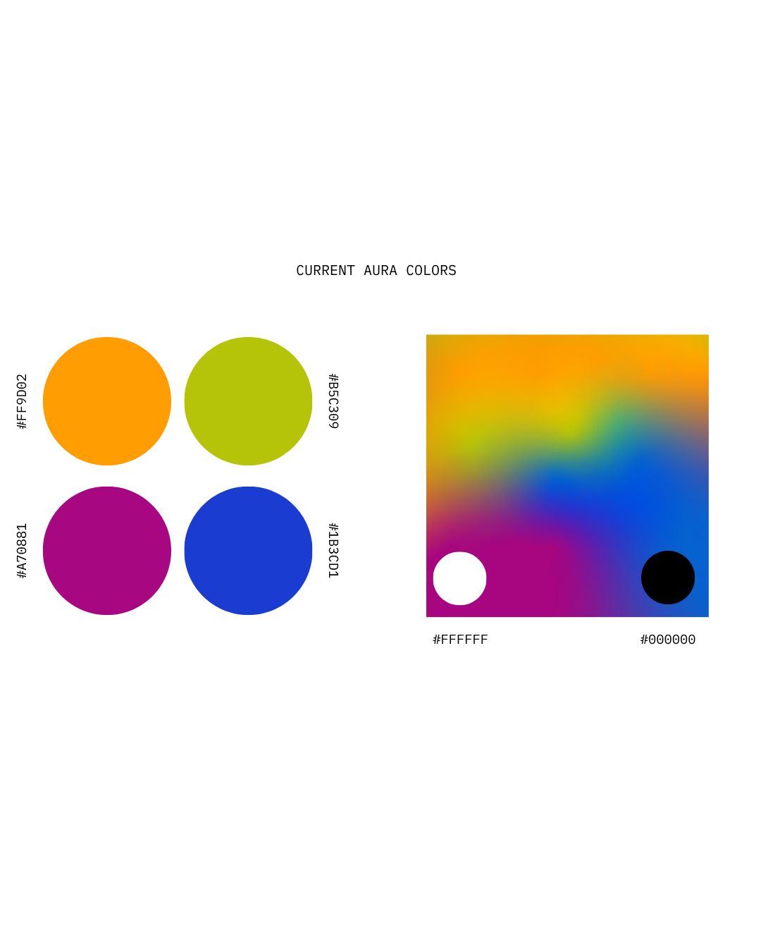
The color system was inspired by Imani’s aura photography, translating her energetic field into a visual language for the brand.
Because aura shifts as a person grows, transforms, and moves through new stages, the palette was designed to feel alive rather than fixed.
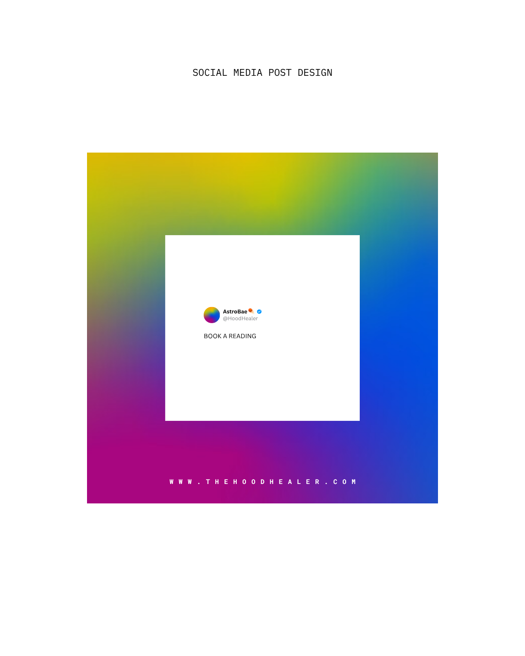
The evolving gradient reflects both Imani’s spiritual expansion and the transformation her audience experiences through her work.


TYPOGRAPHY
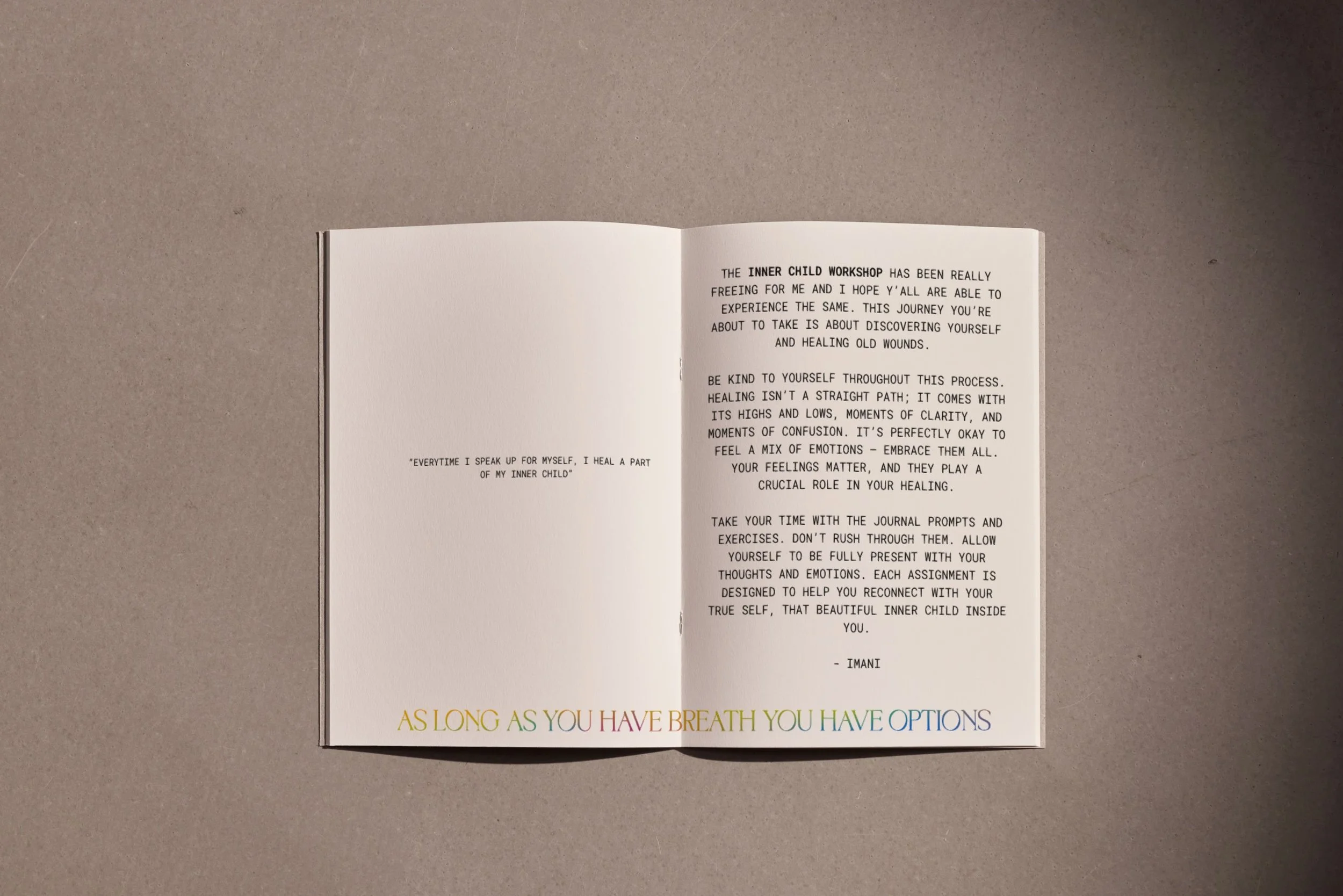
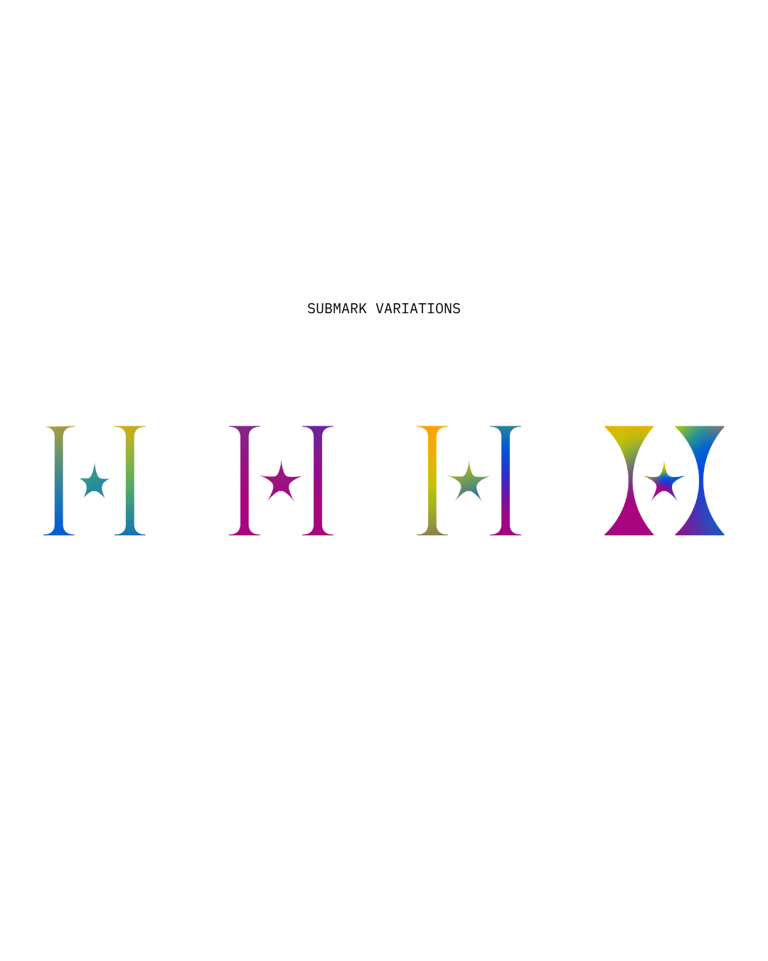
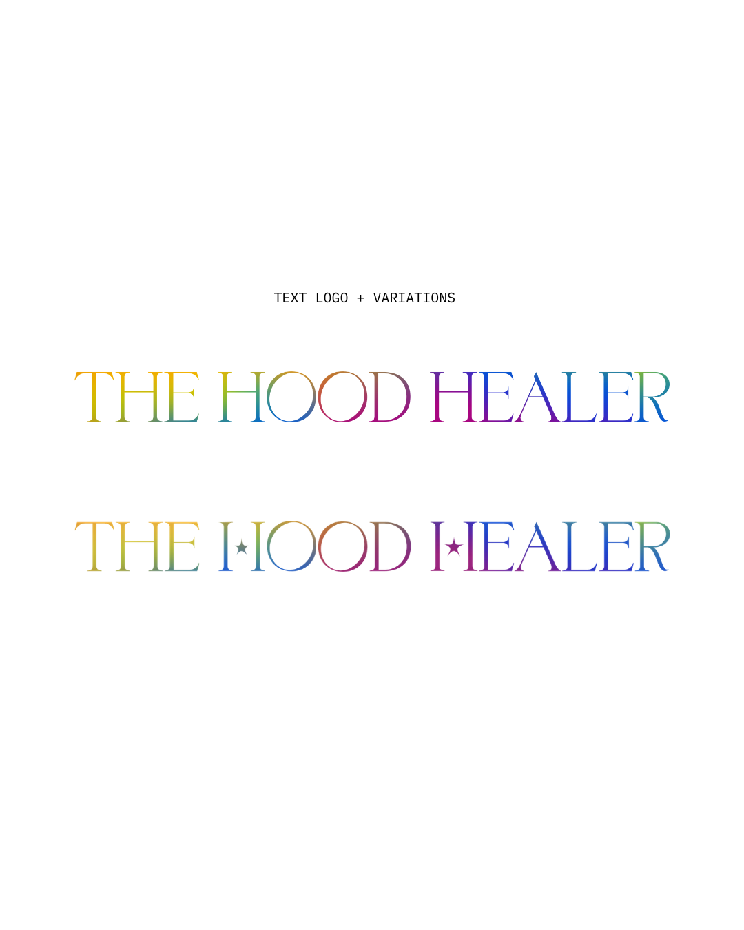
The Story of Nothing was chosen for its balance of elegance and restraint. Its refined serif forms bring a sense of wisdom, intention, and permanence without feeling overly traditional or ornamental.
The typography reflects the way Imani teaches. Grounded, thoughtful, and deeply considered. It feels timeless rather than trend-driven, allowing the identity to evolve while maintaining a strong visual foundation.
Combined with the fluid color system, the typography creates a balance between stability and transformation. One element remains grounded while the other continues to evolve, mirroring both Imani’s personal journey and the ongoing growth of the community she leads.