
w.e. consulting
Helping people lead better, work better, and build healthier organizations.
WE Consulting is a leadership and workplace consultancy focused on helping organizations strengthen the way people communicate, lead, and work together.
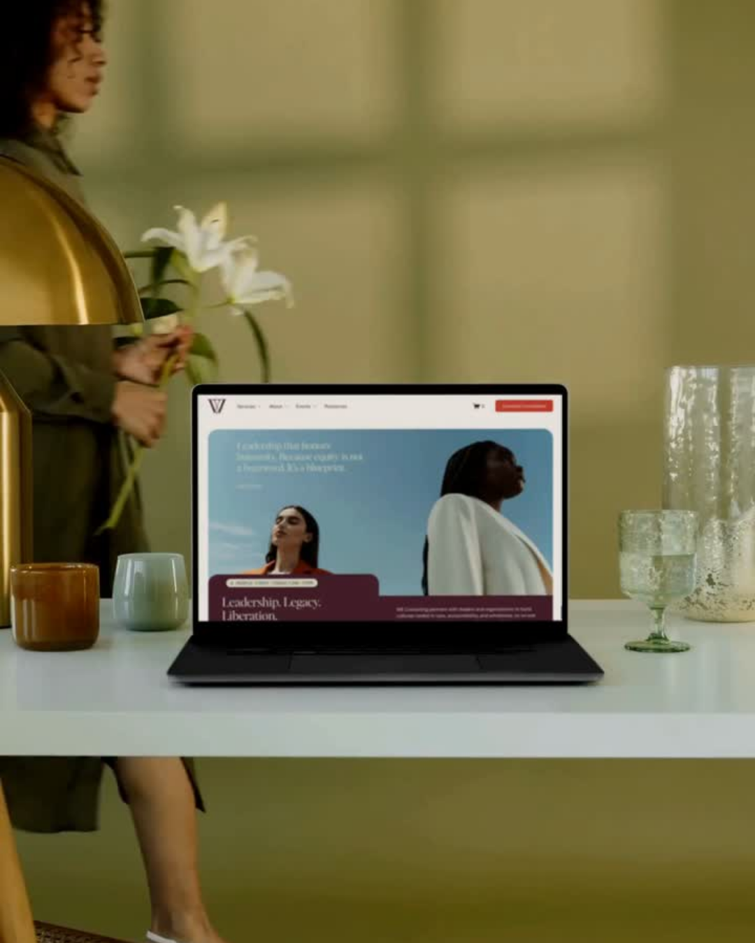
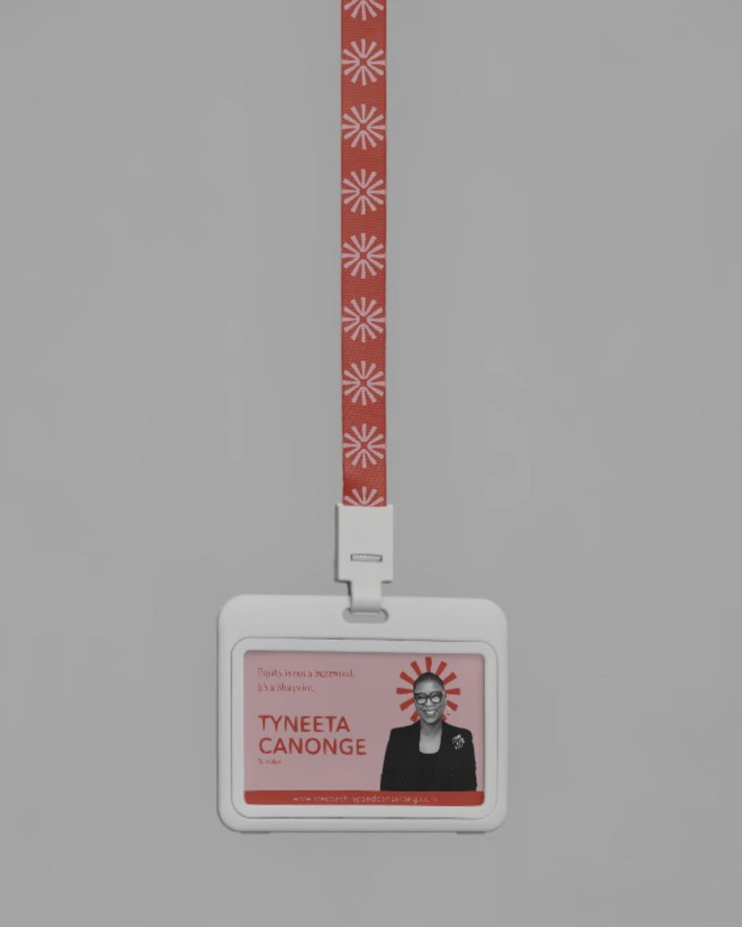
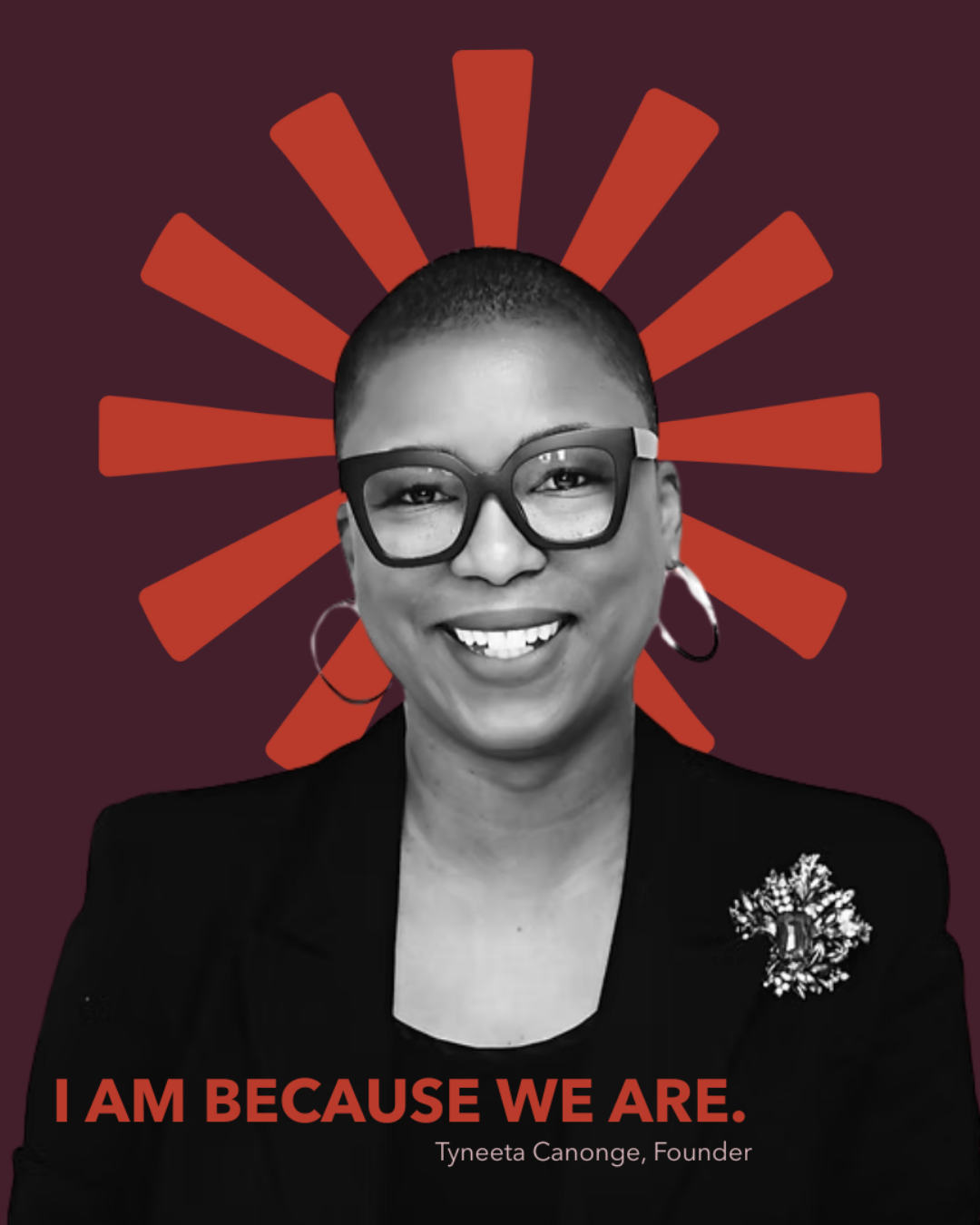
The challenge was translating expertise that can easily feel dense or overly corporate into a brand that felt clear, credible, and accessible. The identity and digital experience were developed to make the firm's thinking easier to understand while maintaining the authority expected within the professional services space.
THE SCOPE
BRAND strategy
VISUAL IDENTITY
creative direction
web design
content strategy
social graphics
brand guidelines
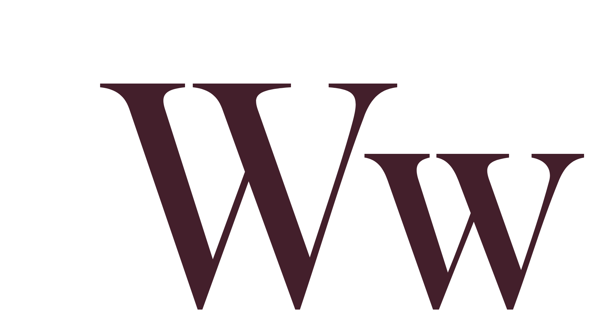
TYPOGRAPHY
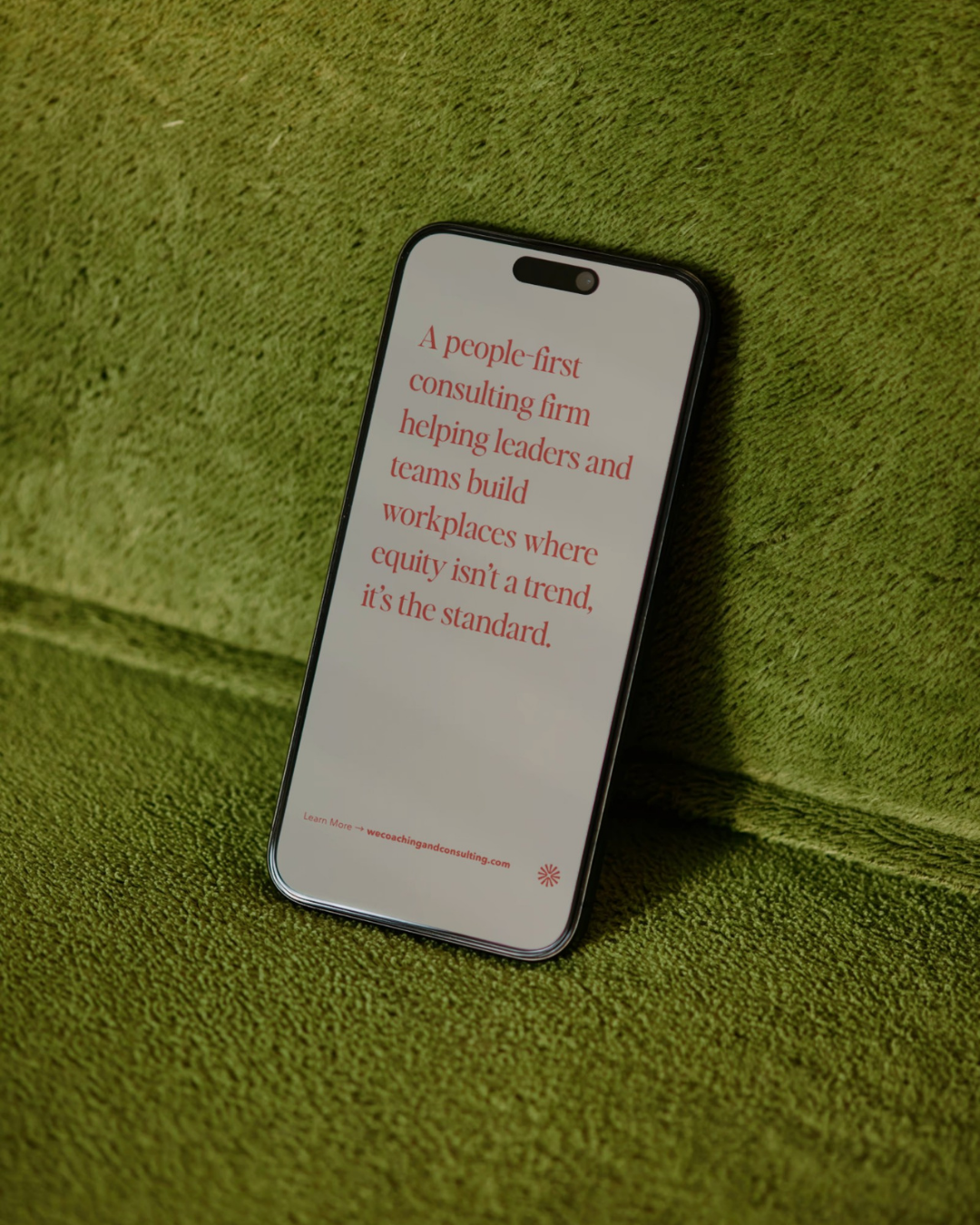
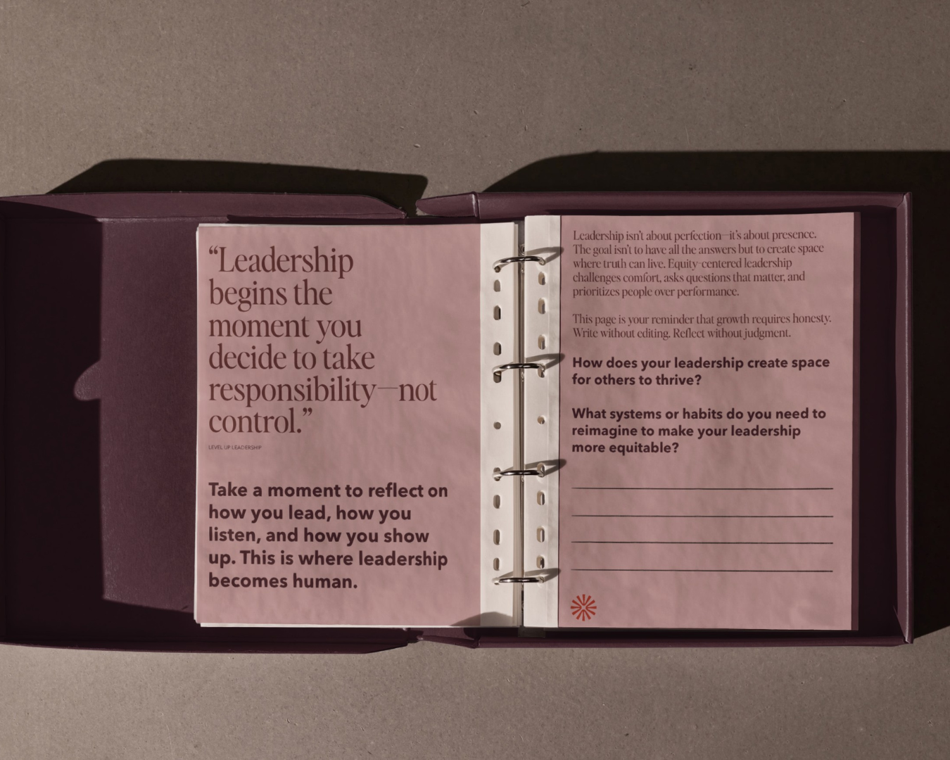
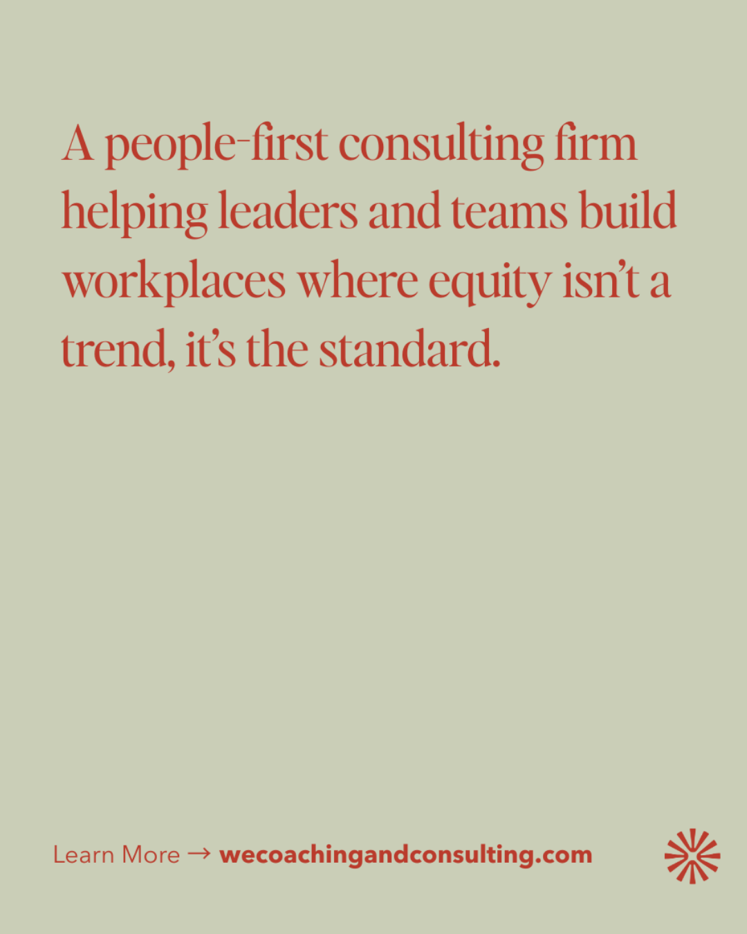
Editor’s Note is an editorial serif that brings intelligence, credibility, and refinement to the brand. Inspired by the typography found in newspapers and magazines, it carries the authority of published thought while remaining approachable and human.
Its elegant proportions and sharp contrast reinforce WE Consulting’s position as a trusted advisor rather than a traditional corporate consultancy. The typeface creates a sense of clarity, confidence, and thoughtful leadership, reflecting the firm’s commitment to helping organizations navigate complex conversations with care and intention.
The result is a visual voice that feels established, insightful, and people-centered, supporting the brand’s mission to make leadership feel both credible and deeply human.
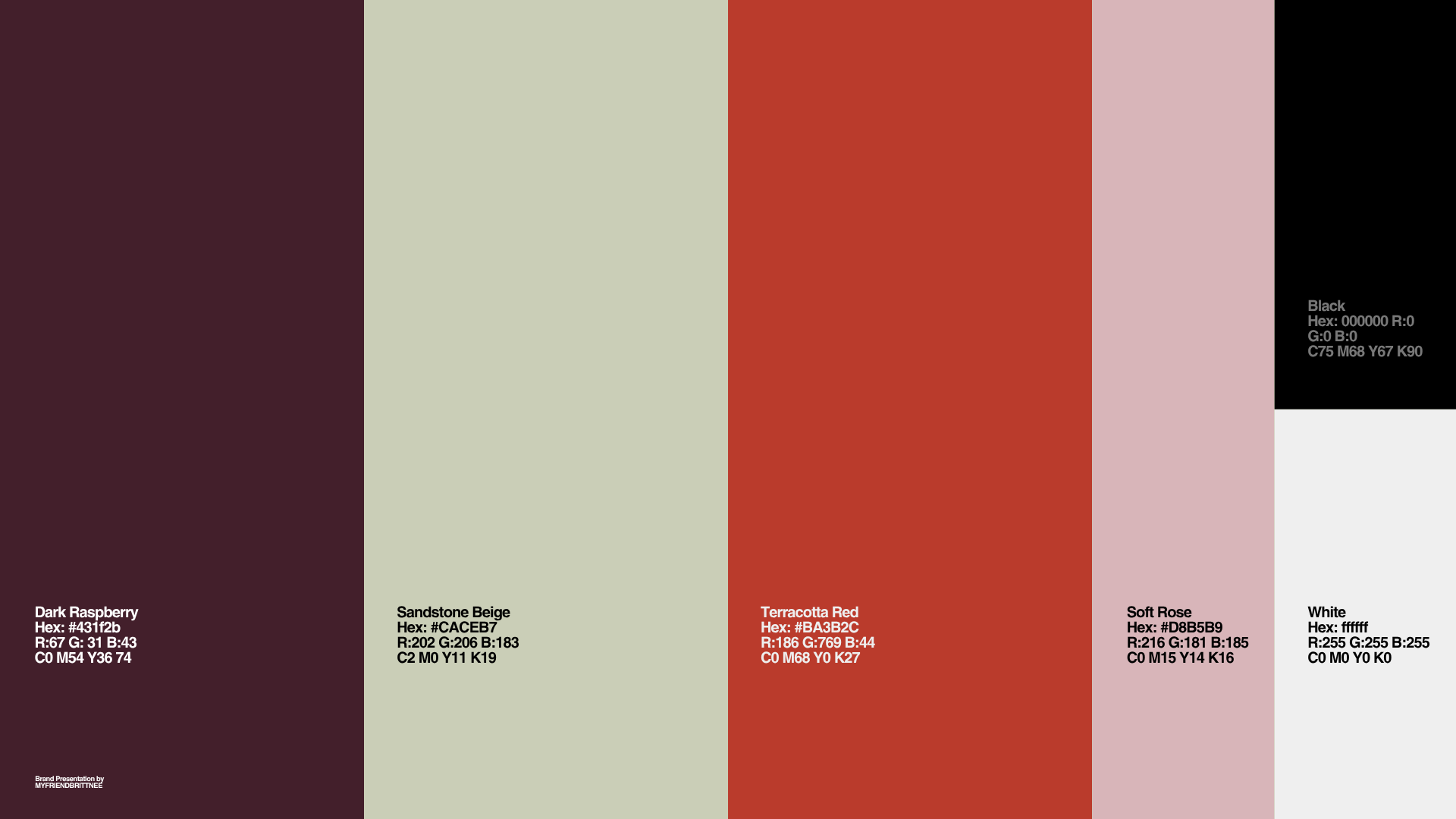
COLOR SYSTEM
The palette was built to feel credible without feeling corporate.
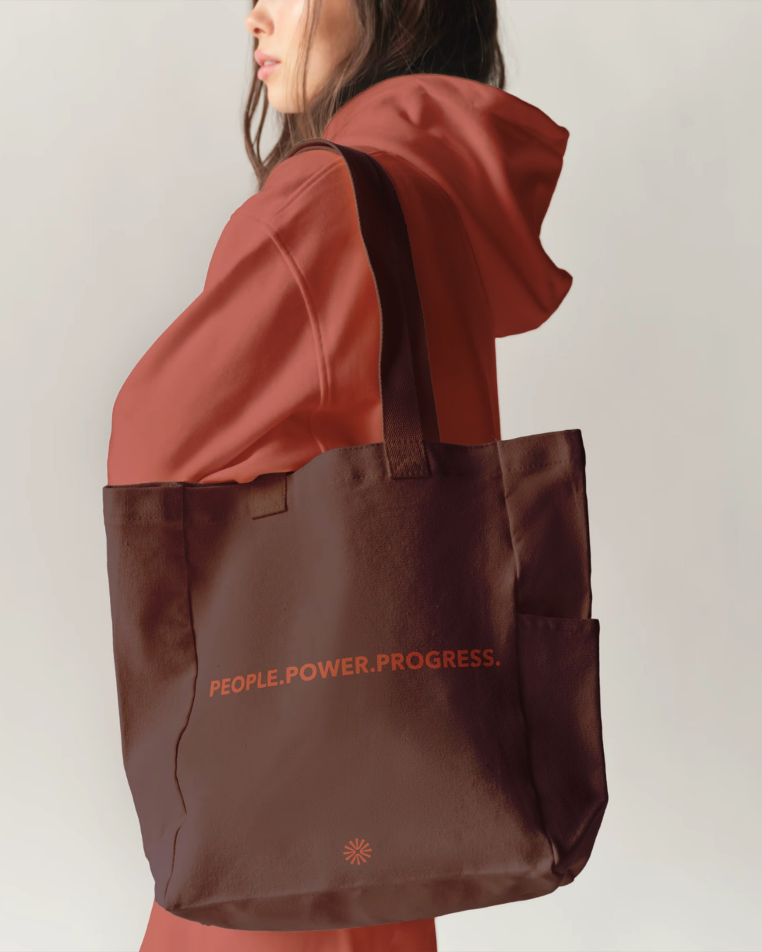
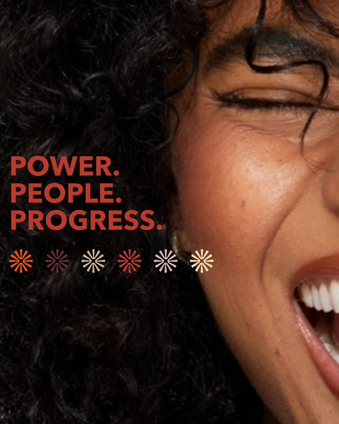
Rich oxblood creates authority, stability, and trust. Soft sage and blush bring warmth, empathy, and ease. Terracotta adds energy and forward movement.
Together, the colors reflect WE Consulting’s people-first approach to leadership: clear, grounded, human, and confident.